Why Avada High Is On My List of Preferred WordPress Themes for Mortgage Broker Websites

Why I like Avada for mortgage broker websites, from calculators and FAQs to lead magnets, forms and the kind of page strategy that turns a basic broker site into something far more useful.
I've looked at a lot of mortgage broker websites, and there's some really good work out there.
The best ones are fast, clear and easy to trust. You land on the page and you know straight away who this person is, what they do, and how to talk to them.
Then there are the ones that leave a lot to be desired. Blocks of text, a stock photo of a couple holding house keys, more text, and a contact form sitting at the bottom of the page doing all the work on its own.
The good news is that the gap between those two groups usually comes down to something fixable. It's mostly about the tools the web designer had available when they sat down to build it.
Which is why one of my preferred starting points for a mortgage broker website is Avada.
If I may, let me (over) explain why, in plain English. hehe
What "modular" means relative to web design (and why, I think you'll like it and want it as part of your Mortgage Broker website tech stack)
Modular is a fancy word that explains why I’d choose this WordPress theme for a Mortgage Broker web design project, so it's worth two, or maybe even seven minutes of your time.
Think of it (your website builder or theme) like a kitchen.
Some themes hand you a bench, a knife and a pile of raw ingredients. Everything you want has to be made from scratch. Want a timeline on your page? Someone has to build a timeline. Want an interactive FAQ that opens and closes? Someone has to build that too. It's all possible. It just costs you hours, and hours cost you money.
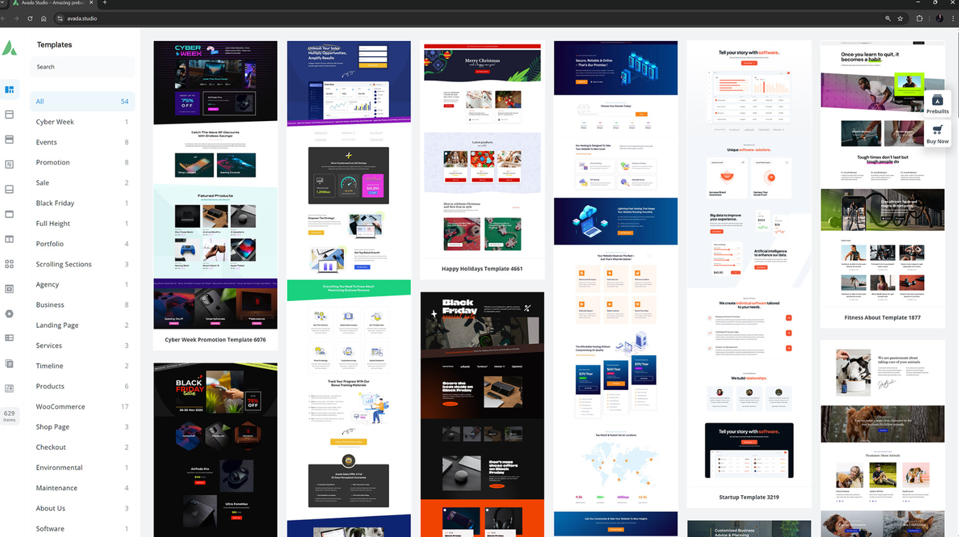
Avada hands you a fully stocked commercial kitchen. Hundreds of pre-built sections, ready to go:
- Timelines
- Image galleries and sliders
- Before-and-after image comparisons
- FAQ toggles and accordions
- Counters, progress bars, testimonial carousels
- Pricing tables and comparison tables
- Advanced, multi-step forms with conditional logic
- Content boxes, feature grids, tabbed sections
- Video sections, maps, social feeds
None of that has to be invented, or built from scratch. It's already sitting there waiting for the moment you / we need it.
So, yes, of course we start with a template that suits your brand, (we’d be stupid not to) and then we extend it. Easily. Section by section, page by page. That's what you actually want out of a website, and it's a lovely position to be in when the ideas start flowing.
The mortgage calculator page: a real example
Here's where all of that stops being theory.
Say we're building your borrowing power calculator page. The simplest version of that page is: embed the calculator, done. Plenty of broker sites do exactly that, and it works fine.
But think about what's happening in your visitor's head at that moment. They've just typed in their income. They've just seen a number. And now they've got about six questions firing off at once. Is that number realistic? What do lenders actually look at? How long does this whole thing take? What do I do next?
Answer those questions right there on the page and you've got a much better chance of keeping them. Leave them unanswered and they'll go and ask Google instead.
With Avada, here's what we can put on that same page without a single line of custom development.
Under the calculator, an FAQ toggle section. All the questions that number just triggered, answered in a tidy click-to-open list. No wall of text, no scrolling fatigue.
Below that, a timeline of the loan process. Pre-approval, property search, formal approval, unconditional, settlement. Laid out visually so they can see exactly where they are and what happens next. This one is gold. It takes the most stressful part of the process and makes it look manageable.
Then a gallery slider. Recent settlements, renovation projects you've helped finance, first home buyers on their doorstep. Proof, presented as something people actually want to look at.
Then a form. A proper multi-step enquiry form that only asks the next question once they've answered the last one. Much friendlier than one long form, and Avada builds them natively.
Here's the underlying principle: the more interesting and interactive the page, the more of your information actually gets read.
People scan websites. But they'll happily click a toggle. They'll follow a timeline. They'll swipe a gallery. And every one of those small interactions is another few seconds on your site, another piece of information absorbed, another notch of trust.
They also just appreciate it. A well-presented page tells them you're organised, you're modern, and you'll probably handle their loan the same way.
Better tools mean better strategy
Here me out, because this is actually my favourite part, and it's one of the biggest benefits of choosing the Avada theme for your Mortgage Broker website design.
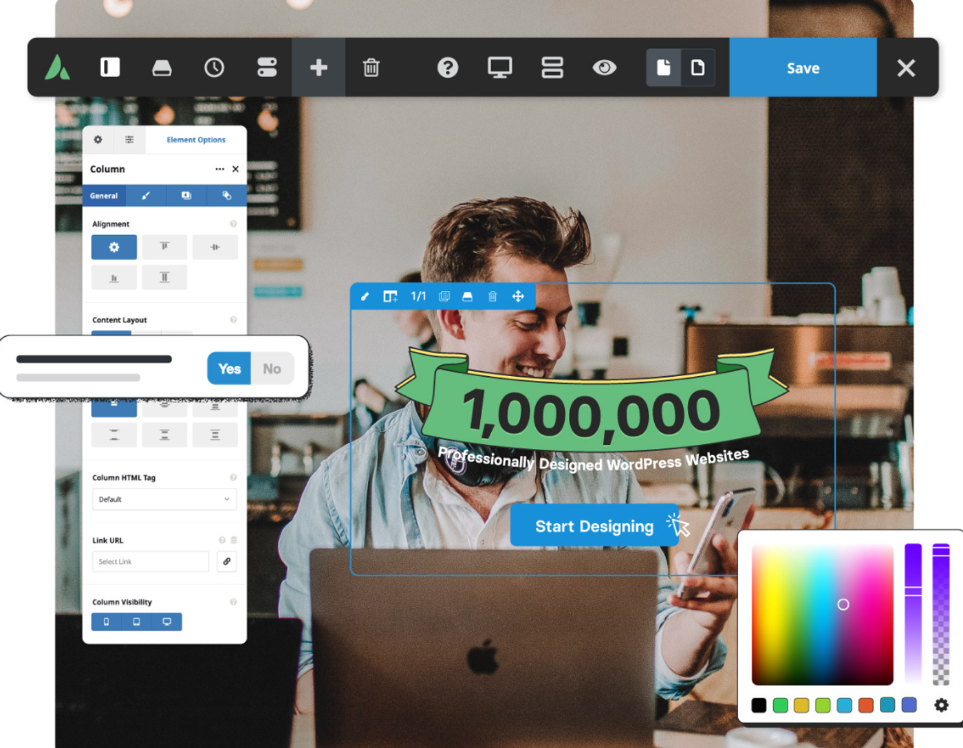
When the web designer knows they've got hundreds of components available, the conversation with you changes. The strategy session goes deeper, because nothing gets ruled out for being "too hard to build."
And by strategy, I mean the experience of each individual page:
- What's the goal of this page?
- What happens the moment someone lands on it?
- What do you want them to see first?
- What do you want them to read?
- What do you want them to know by the time they scroll past the halfway mark?
- What do you want them to do next?
- And how does that action lead to a booked call, a signed client, a lodged application?
That's real website strategy, and it's an enjoyable conversation to have when you know you can build whatever you come up with. Otherwise you end up designing to the limits of the theme, trimming the good ideas out of the plan as you go.
If you'd like to see how we run that process, have a look at our business website design approach. The build is the easy bit. The thinking is what makes it work.
The lead magnet opportunity, you’ll want to read this
Picture how this usually goes.
A broker gets a new website. Six months later they realise they should probably have a downloadable First Home Buyer's Guide on there, a lead magnet, that collects the email address and drops that person straight into their Mailchimp list for a nurture sequence.
They ask the designer. The designer quotes for it. Because on most themes, that's a real piece of work: a form, a delivery mechanism, a third-party integration, testing.
So it never happens. And the bigger miss is that the designer never raised it in the first place. Web designers naturally steer away from pitching things that are painful to build.
Avada has email marketing integrations baked in. Mailchimp and a solid range of others, plus the form tools to feed them. So when we're planning your site, the lead magnet conversation actually happens, because it costs almost nothing to say yes to.
That's the hidden value of a well-equipped theme. It makes the good ideas likely.
Pair that with a proper SEO strategy and you've got the full loop: people find you, people read you, people hand over their email, and your marketing keeps working while you're on the phone with a lender.
The Progressive Web App feature (this is worth having for your mortgage broker website)
Avada has a feature most brokers have never heard of. You can turn your website into a Progressive Web App.
In normal-person terms: when someone visits your site on their phone, they get a small prompt saying add this to your home screen. If they tap it, your logo appears as an icon on their phone, sitting right next to their banking app.
Tap that icon and your website opens in a special app-like version. No browser bar. Very fast. Snappy. It even works when they've got no internet connection.
Do you need it? No. But think about who's using your calculator. Someone in the middle of a house hunt, who'll want to come back to that borrowing power number more than once. Being an icon on their home screen carries a lot more weight than a bookmark they've forgotten about.
It's a bit of extra development work, though not much, and it's a lovely way to stand out from your competitors. If it were my site, I'd switch it on.
What about Elementor? What about Divi?
Fair questions. Both are good tools with plenty of great sites running on them.
Elementor is a fantastic page builder. But you'll be custom-building most of the components I've described above. Everything on that calculator page, the timeline, the toggles, the multi-step form logic, becomes design and development work every time. And when you want to add a new page with new features next year, you're back in the same position. It's absolutely doable. It's just slower and more expensive to extend.
Divi is the other one I like, and it's the closest comparison. But it doesn't come anywhere near Avada's library of pre-built sections, and it doesn't have the same depth of ready-made third-party integrations. So again: more custom development, more hours, more cost to add things later.
One thing to know about Avada. It's one of the heavier WordPress themes, so left unattended it can mean a slower site. It needs a build team who knows how to keep it lean: trimming unused features, sorting out image handling, getting the caching right. Done properly, it flies.
It's also the most popular theme in the entire ThemeForest marketplace, which counts for something when you're picking a platform your business will sit on for the next five years.
If you'd like the fuller picture on how we approach WordPress builds and keep heavy themes fast, that's all on our WordPress web design page.
So, should you / we use Avada for your Broker website build?
It's still a big job to put a great mortgage broker website together. The theme doesn't do the work. It doesn't write your copy, it doesn't understand your ideal client, and it certainly doesn't build your strategy.
What it does is open up your options.
Every idea that would normally get dropped from the plan for being "too hard" is right there, ready to go. The timeline. The interactive FAQ. The lead magnet. The multi-step form. The app-like experience.
That's why Avada is my preferred starting point. It gives the designer everything they need to build one of those mortgage broker websites that lands firmly in the really good category, and there's no reason yours shouldn't be one of them.
Ready to get started?
Want the complete checklist behind this approach? Download the 14-page Mortgage Broker Website Field Guide with 50+ website essentials, tools, tech stack and a 25-point self-audit.
Download the Free Mortgage Broker Field GuideSee exactly how we build for your industry:
Mortgage Broker Website DesignWant the calculator, the timeline, the FAQs and the lead magnet all working together? Let's map out your pages properly.
Book a free discovery callNo hard sell. Just a friendly chat about what your website could be doing for you.
Common questions
Is Avada a good WordPress theme for mortgage broker websites?
Yes, especially if you want room to build more than a basic brochure site. Avada gives us a big library of ready-made sections and tools, so things like FAQs, timelines, galleries, forms and lead magnets are much easier to add without turning every idea into a custom development job.
Can Avada handle mortgage calculators?
Yes. The calculator itself may come from a lender, aggregator or third-party provider, but Avada gives us plenty of ways to build the page around it. That means we can add FAQs, a loan process timeline, enquiry forms, galleries and other useful content underneath the calculator instead of just dropping an embed onto an empty page.
Can Avada connect with Mailchimp and lead magnets?
Yes. Avada includes form tools and email marketing integrations, including Mailchimp. That makes it much easier to build things like a First Home Buyer's Guide, collect an email address and move that person into a nurture sequence without needing to reinvent the whole setup.
Is Avada slower than lighter WordPress themes?
It can be if it's left loaded up with features you don't need. Avada is a heavier theme, so the build needs some care. Unused features should be switched off, images handled properly and caching set up well. Done properly, it can still be very fast.
Is Avada better than Elementor or Divi for a mortgage broker website?
It depends on the build. I like Elementor and Divi too. The reason Avada sits high on my list for mortgage broker sites is the amount it gives us out of the box. The more useful pieces we already have available, the easier it is to keep extending the site without every new idea becoming another custom build.
Can an Avada mortgage broker website be expanded later?
That's one of the main reasons I'd consider it. You might launch with the core pages and add a lead magnet, better calculator pages, new service pages, more FAQs or a more advanced enquiry process later. Avada gives us plenty to work with when the site grows.
Want a second opinion on your own site?
Start your project