
Two mortgage broker templates, side by side: Loanly on Webflow and Odet on WordPress with Elementor. What each one gets right, where each falls short, and what still has to be built either way.
Most mortgage brokers who come to us have already been down a template rabbit hole. You search "mortgage broker website template", you find something that looks a hundred times better than the site you've got, and you think: surely I can just buy that.
Sometimes you can. Often a template is a genuinely sensible starting point — it saves design time, it gives you a proven page structure, and it costs a fraction of a bespoke build. But templates are marketed on their prettiest screenshot, and the screenshot is never where the trouble is. The trouble is three clicks in, on the page nobody photographs.
So I've taken two of the better-known mortgage broker templates and gone through them properly, page by page, the way I would if a client had bought one and handed it to me. One is built for Webflow, one is an Elementor kit for WordPress. Neither is a bad product. They're just built to very different standards of depth.
How I judge a broker template
A template review that only talks about looks is close to useless. Anything on a marketplace in 2026 looks fine. What separates a template you can build a real business on from one you'll fight with is less glamorous:
- Structure — is there a sensible page for every job a broker's site has to do, or is it one long homepage with everything bolted on?
- Conversion paths — how many ways can a visitor start a conversation, and are they present where the intent actually peaks?
- Content depth — do the inner pages have enough room for real copy, or do they run out of layout after three paragraphs?
- CMS structure — can you add loan types, team members, locations and articles as content, or does every new page mean rebuilding a layout by hand?
- Performance and accessibility — how much of the speed and contrast is baked in, and how much will need fixing?
- Editability — after handover, can you change a headline and swap a photo without ringing someone?
That last one matters more than brokers expect. A site you're nervous to touch quietly stops being updated, and a site that stops being updated quietly stops ranking.
Loanly (Webflow) — 5/5
Loanly is a Webflow template aimed squarely at mortgage and home loan businesses. You can walk through the whole thing yourself on the Loanly template listing, and I'd suggest you do before reading my notes on it.
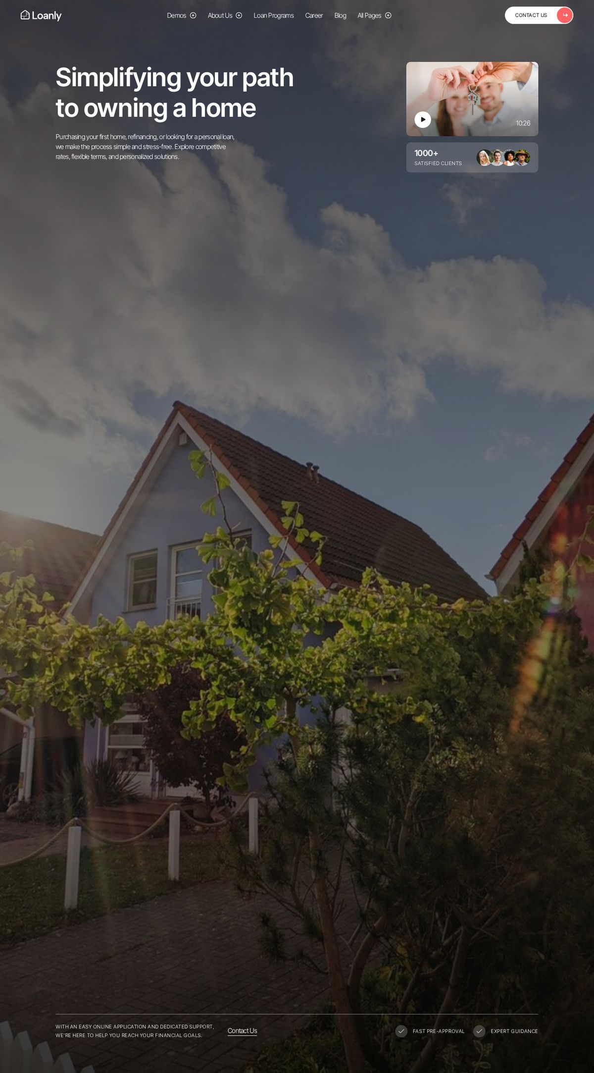
The first thing worth knowing is that Loanly ships three complete homepage layouts, not one. That sounds like marketplace padding, and in a weaker template it would be. Here it's the most useful thing in the package, because in Webflow those three homepages are effectively a component library. Between them you get several hero treatments, a couple of process layouts, a pre-approval form block, program grids, testimonial arrangements and a rate-comparison style section — all built in the same style system.
In practice I don't pick a homepage for a client. I pull the strongest sections out of all three and assemble a homepage around what that particular broker is trying to say. That's a very different, and far better, outcome than picking demo two and living inside it.
The loan programs pages are the strongest part
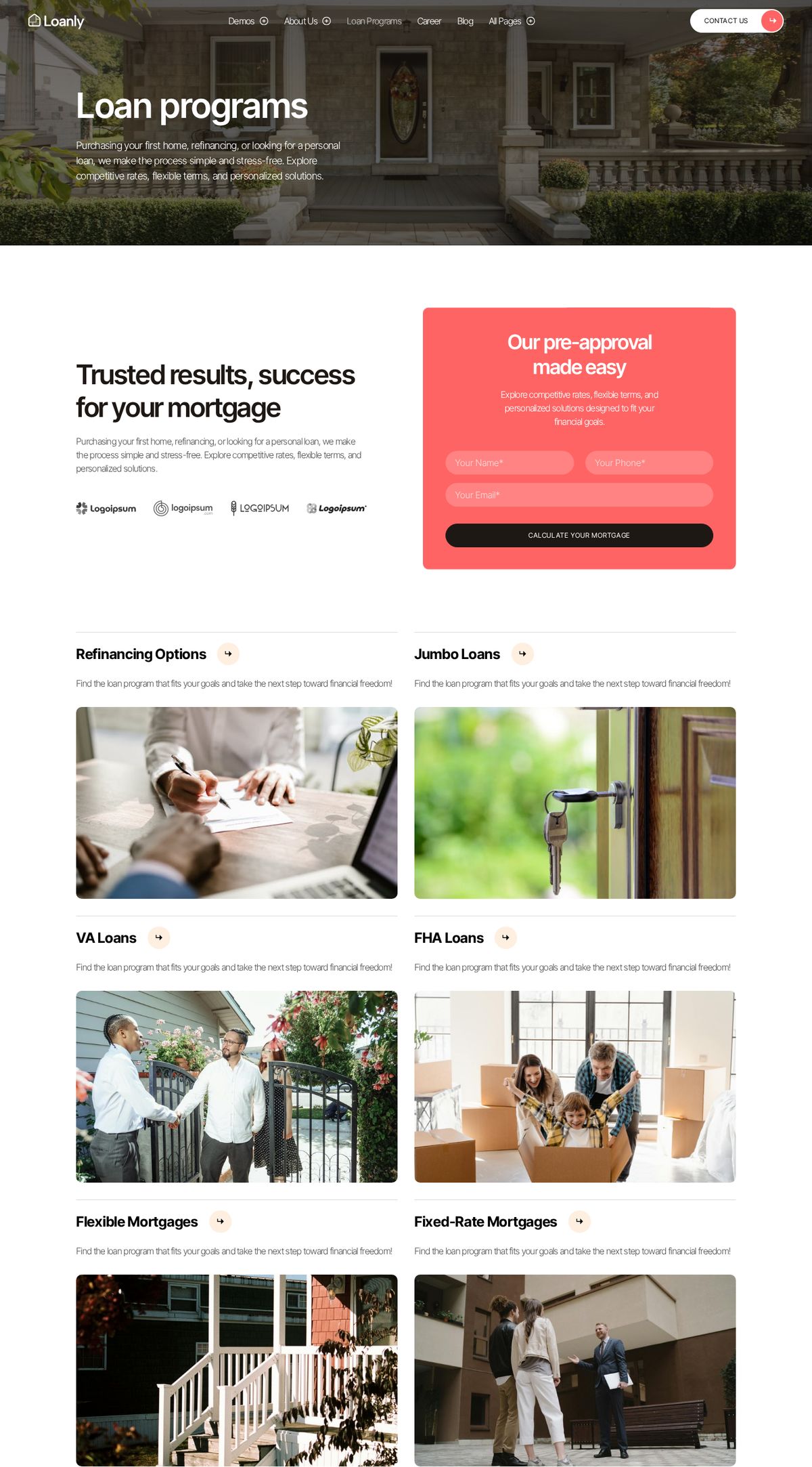
This is the page a broker's site lives or dies on, and Loanly treats it seriously. The pre-approval form sits near the top where intent is highest rather than being buried in a footer. Underneath, the loan types are laid out as a proper grid with a photo and description each — which means an Australian brand can map them straight onto first home buyer, refinancing, investment lending, construction, self-employed and commercial without touching the layout.
There are three variants of this page too, so if you'd rather present programs as a list, a grid, or with a heavier editorial treatment, that decision is already designed for you.
Where Loanly needs work: the program detail template
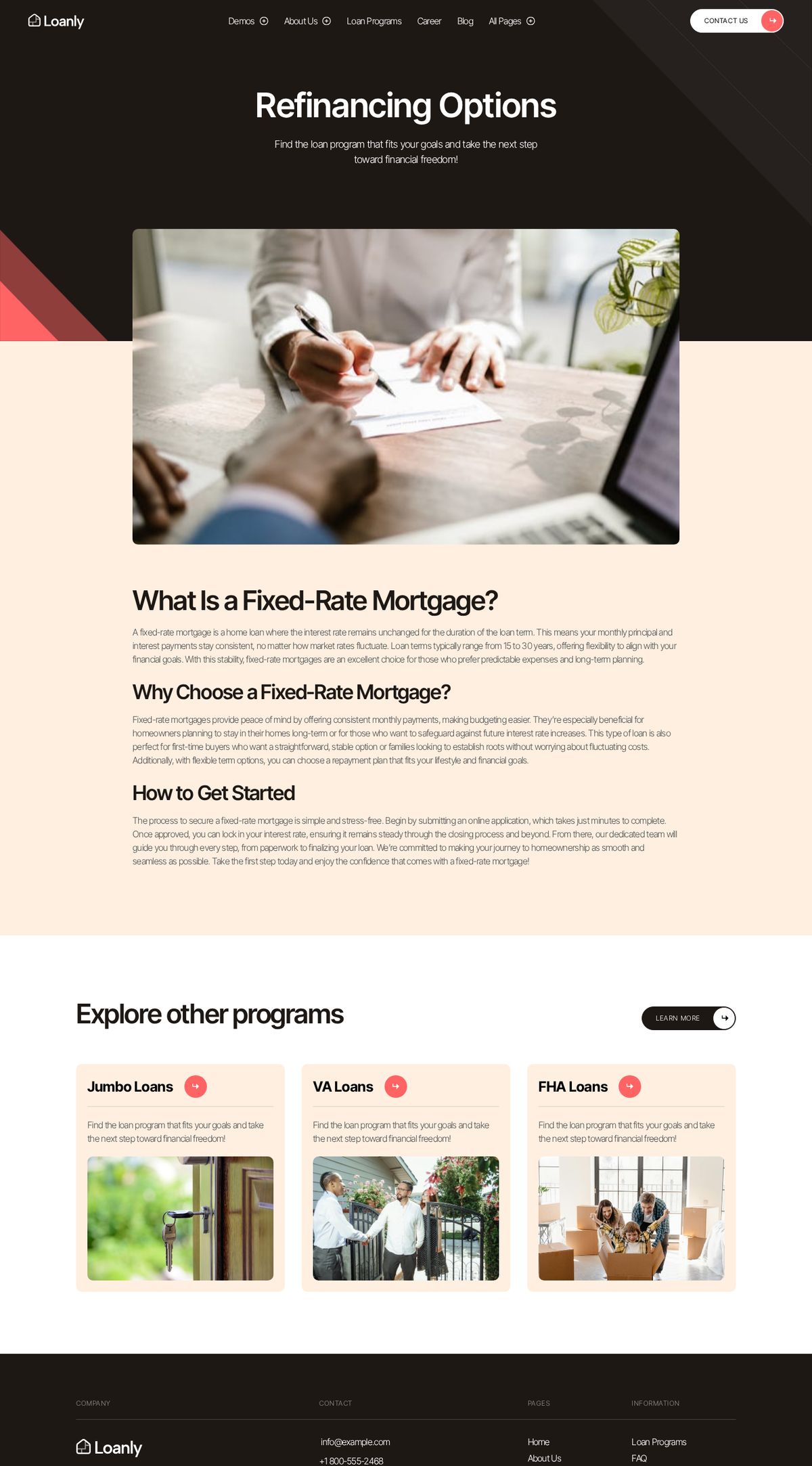
This is the honest weak spot. The individual program page — the one you'd use for "Refinancing" or "First Home Buyer Loans" — is a hero, one image, three short text sections and a related-programs row. That's thin. These are precisely the pages you want ranking for "refinance broker Newcastle" or "first home buyer broker Hunter", and thin pages don't rank against brokers who've written properly.
It's fixable, and fixing it is normal work rather than a rescue job. In a real build I'd extend that template with an eligibility summary, a costs and fees section, an FAQ block, a scenario or case-study slot, a calculator embed and a sticky enquiry CTA. Webflow's CMS makes that a one-time job that then applies to every loan type you publish. But you should know going in that the template gives you the shell, not the substance.
About, Team, Careers and FAQ
The About page is nicely composed but light on content — fine for a demo, not enough for a broker whose whole pitch is trust. It wants a founder story, accreditation detail, aggregator and membership information, and a proper team introduction. Again: normal work, but work.
The Team section is better than most templates manage, because team members are a CMS collection with their own detail pages. For a brokerage with several brokers that's genuinely valuable — each broker gets an indexable page with their own specialties and contact path, which is often where referral traffic lands.
There's also a Careers section with a job-listings collection and individual role pages. A solo broker won't need it. A growing brokerage will, and building that from scratch later is not free.
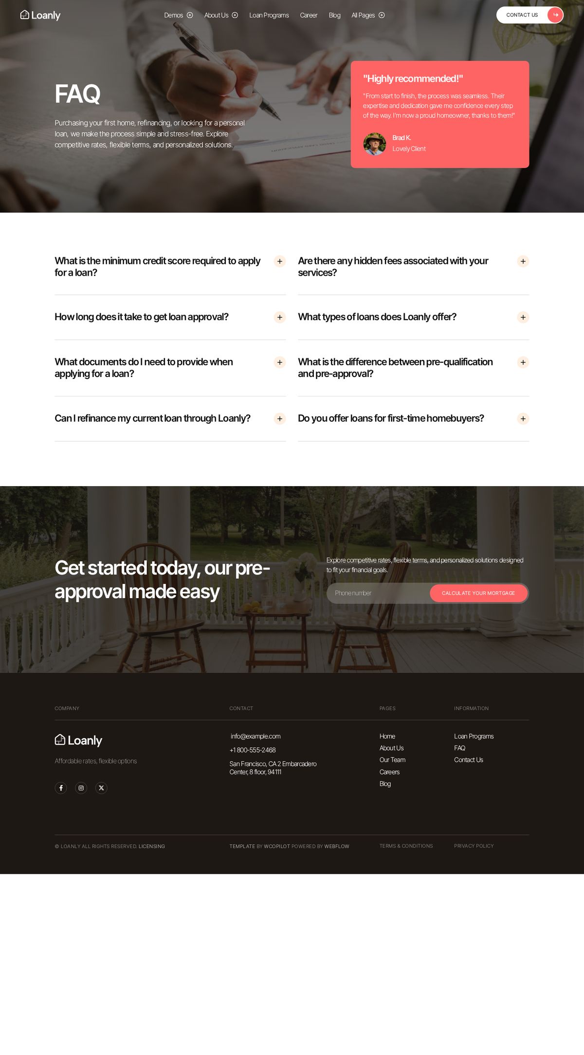
The FAQ page deserves a specific mention. It's a two-column accordion that's genuinely easy to scan, and it's the kind of block I'd lift and reuse across loan type pages rather than leaving stranded on a single page. FAQ content is also what AI assistants quote back when someone asks a question about brokers in your area, so it earns its keep twice.
The colour question
Loanly is built around a coral-red accent. It looks sharp, but red carries an unhelpful association in a finance context, and it's also the colour most Australian brokers' compliance-adjacent material avoids. For most brokers I'd move to a deep navy with a warm gold or green accent — steadier, and it photographs better against the kind of imagery brokers actually have. In Webflow that's a swatch change, not a rebuild.
Odet (WordPress / Elementor) — 3/5
Odet approaches the same brief from the WordPress side, and the first thing to be clear about is what it actually is. It isn't a standalone WordPress theme. It's an Elementor Template Kit — a set of pre-built page designs you import into the free Hello Elementor theme, with ElementsKit Lite, Jeg Elementor Kit and MetForm doing the heavy lifting for widgets and forms. You can see the listing on ThemeForest.
That distinction matters. A template kit means your site's foundation is Elementor plus a stack of add-on plugins rather than a purpose-built theme. That's not a problem in itself — it's how a large share of WordPress sites are built — but it does mean your performance and long-term maintenance depend on keeping that plugin stack healthy.
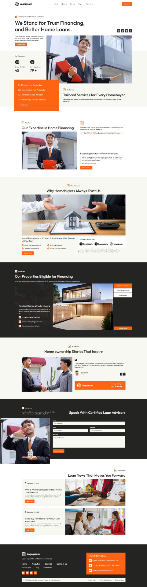
The homepage is the strongest thing here, and it's genuinely good. The composition is confident, the orange accent is warm without being loud, and there's a subtle text-reveal animation on the headings that gives the page a bit of life without turning into a showreel. Pulling recent blog posts onto the homepage is also a smart inclusion — it signals an active business rather than a brochure that's been sitting there since 2021.
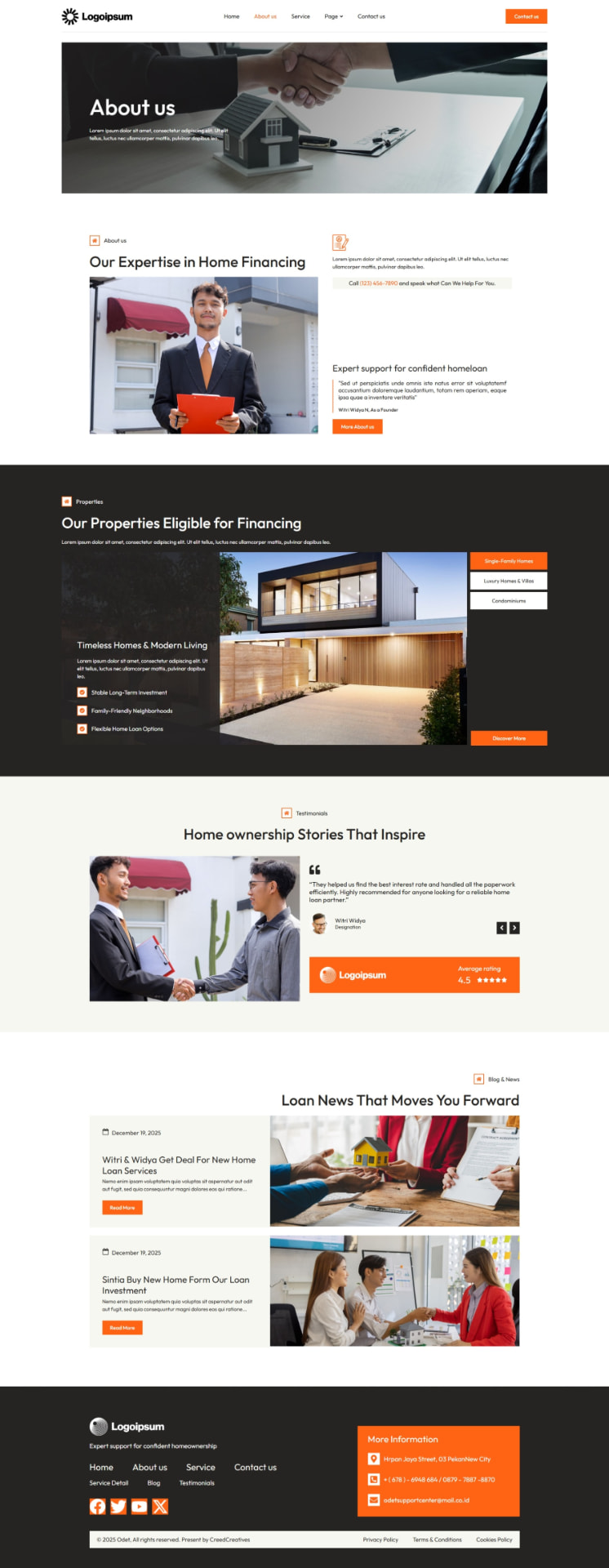
The About page holds up too. There's a clear expertise section, room for a genuine story, testimonials positioned where they help, and a natural path onward. If a client insisted on using this kit largely as-is, the homepage and About page would carry most of the weight.
Where it thins out
The Services, Properties and Why Choose Us sections are where the three-star rating comes from. They're attractive, but they're repetitive — the same card pattern with different icons — and they don't say enough. Several service entries carry near-identical descriptions, which is a demo-content habit that gets copied into live sites more often than anyone admits.
For a broker that's a real problem, because those service cards are exactly where you differentiate. First home buyer lending, refinancing, investment lending, self-employed and low-doc, construction, commercial and asset finance are genuinely different conversations with different anxieties attached. Six cards that all say "we find the right loan for you" convert nobody and rank for nothing.
The Properties section is another one to think about. It suits an American mortgage company that also lists real estate. Most Australian brokers don't, and I'd usually repurpose that layout into loan scenarios or case studies rather than delete a perfectly good design.

The contact page and form are perfectly serviceable. The form is short, which is right — name, email, phone, message. In a live build I'd add a loan-purpose dropdown so enquiries arrive pre-sorted, wire submissions to email and a CRM, and make sure there's a booking link for people who'd rather grab a time than write a message.
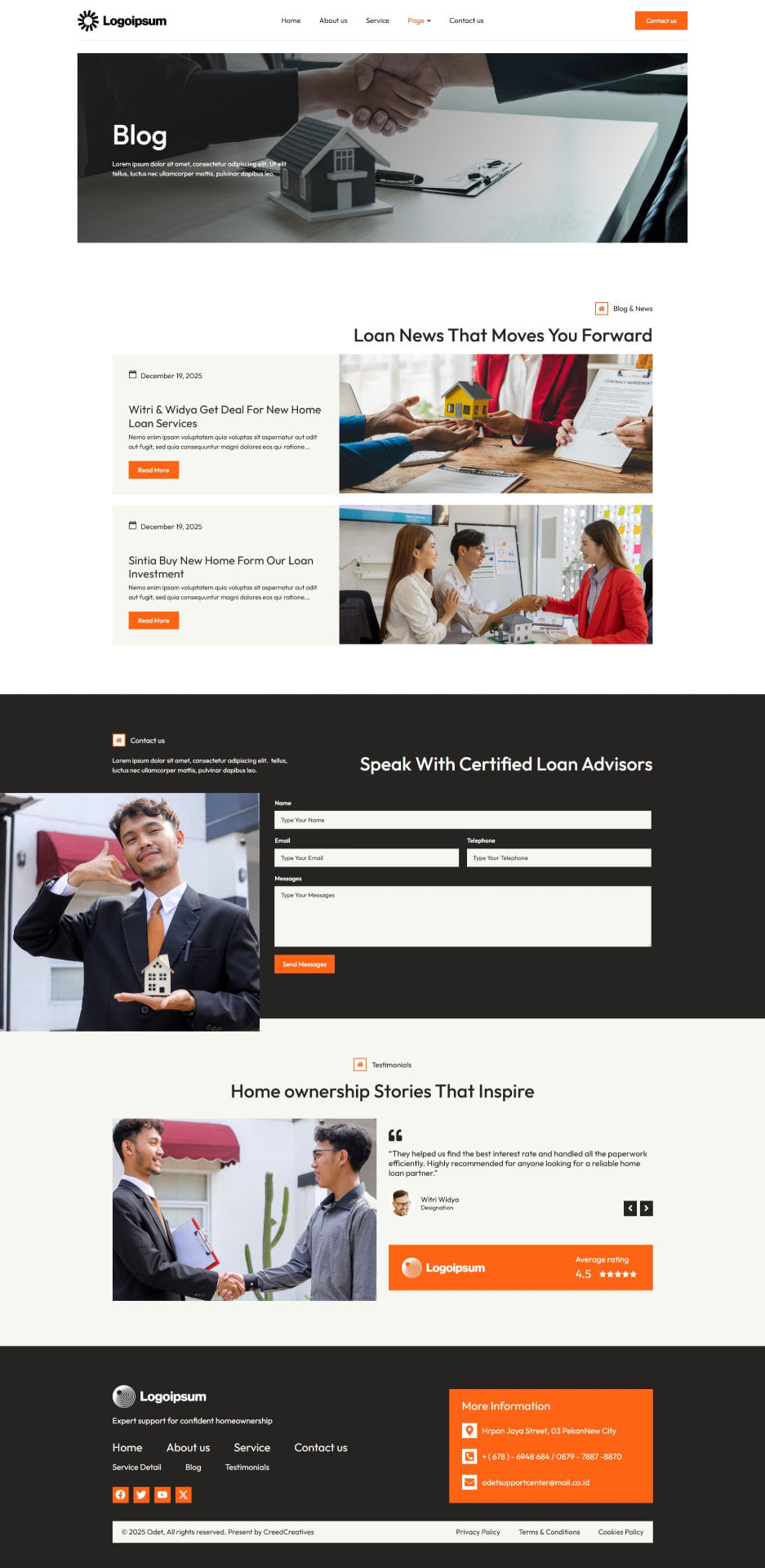
The blog templates are fine, and the decision to put an enquiry form and testimonials alongside the article feed is a good one. Blog readers are usually mid-research, and giving them somewhere to go beats sending them back to the homepage.
The flip side of an Elementor kit is real: flexibility. Anything sparse can be extended by anyone who knows Elementor, without a developer and without touching code. That's a genuine advantage over a locked-down theme, and it's the main reason Odet is worth considering despite the thin sections.
Webflow vs WordPress for a mortgage broker
This is the question underneath the template question, so here's the comparison without the usual platform tribalism.
| Webflow | WordPress | |
|---|---|---|
| Design quality out of the box | Very high — templates are built by designers with tight control over spacing and type. | Varies enormously by theme and builder. The ceiling is just as high; the floor is much lower. |
| Customisation | Deep visual control, but structural changes usually need someone comfortable in Webflow. | Effectively unlimited. Anyone competent with Elementor can restructure a page. |
| CMS | Clean, structured collections. Excellent for loan types, team members and articles. | Mature and extremely flexible. Custom post types handle anything you throw at them. |
| SEO | Strong fundamentals built in — clean markup, easy meta control, automatic sitemaps. | Very strong once properly configured, with more control over technical detail than any other platform. |
| Performance | Fast by default because there's less to go wrong. | Fast when built with restraint; slow when loaded with plugins and a heavy builder. |
| Ease of editing | Easy for text and images. Layout changes need the Designer. | Easy once set up well. Elementor lets you change almost anything, which is a benefit and a risk. |
| Integrations | Good, and improving — most mainstream tools embed cleanly. | Unmatched. If a tool exists, there's a WordPress path to it. |
| Maintenance | Minimal. No plugin updates, no security patching on your side. | Ongoing. Core, theme and plugin updates plus backups and security need someone responsible for them. |
| Scalability | Comfortable up to a few hundred pages; costs scale with CMS items. | Scales to thousands of pages without complaint. |
| Solo broker | Excellent fit. Low maintenance, sharp design, nothing to look after. | Good fit if you'll publish regularly or want deep integrations. |
| Larger brokerage | Works well, particularly with multiple broker profiles. | Usually the stronger choice — more room for locations, teams, content volume and CRM integration. |
I build on both, and the honest answer is that the platform is rarely what decides whether a broker's website works. Structure, copy and follow-up decide that. Pick the platform that matches how you'll actually run the site, then spend your energy on the content.
Neither template includes a mortgage calculator
Worth flagging early, because brokers almost always assume calculators come in the box. They don't — not in Loanly, not in Odet, and not in most broker templates. A "calculator" section in a demo is usually a styled form that leads to an enquiry, not a working repayment or borrowing-power tool.
Real calculators come from a third-party provider, typically on a monthly or annual subscription, and they embed into either platform. That's actually the sensible arrangement: rates, lender policy and serviceability assumptions change, and you want a provider maintaining those figures rather than a static script written once and quietly going stale.
We recommend a provider based on how you want to use them — some are purely informational, others capture the lead alongside the result — and handle the integration so the calculator matches the rest of the site instead of looking like an iframe someone pasted in.
What a strong mortgage broker website actually needs
Templates aside, this is the checklist I work to. If a template covers most of it, it's a good starting point. If it doesn't, you're buying a look and building the site anyway.
Getting in touch
- A clear primary call to action repeated down every page, not just in the header.
- A short enquiry form that asks for loan purpose, so enquiries arrive pre-sorted.
- Phone number as a tap-to-call link, and an email address that isn't hidden behind a form.
- Online booking, so people who'd rather grab a time than write a message can do exactly that.
- A calculator or two, with an obvious next step after the result.
Content that does the selling
- A dedicated page per loan type — first home buyer, refinancing, investment, construction, self-employed, commercial, asset finance.
- Guides for the situations people search: buying your first home, refinancing when your fixed rate ends, borrowing as a sole trader.
- Loan scenarios or case studies written honestly, with figures only where they're genuinely yours.
- Individual broker profiles — people choose a person, not a brokerage.
- An FAQ section that answers the awkward questions about fees, commissions and credit checks.
- A blog that's actually updated, even if it's monthly.
Trust and compliance
- Credit licence or authorisation details, aggregator and industry membership, stated plainly rather than shrunk into the footer.
- Genuine reviews, ideally pulled through from Google.
- A clear explanation of how you're paid — brokers who address this directly convert better than brokers who avoid it.
- Privacy policy, credit guide and terms that are current and easy to find.
The technical floor
- Genuinely mobile-first, because most first visits arrive on a phone.
- Fast on mobile data, not just on your office wifi.
- Accessible: real contrast, keyboard navigation, labelled form fields, sensible heading order.
- Proper page titles, descriptions and schema so search engines and AI assistants can describe you accurately.
- Analytics and conversion tracking, so you can see which pages produce enquiries.
A word about photography
Both templates lean on strong photography, and both look markedly worse without it. This is the most common way a good template turns into a mediocre website.
Get real photos of yourself and your team. A broker is a trust purchase, and a genuine photo of the person a client will sit across from does more work than any headline. Supplement with quality stock — Envato Elements and similar libraries are inexpensive and fine for supporting imagery — and be selective, because the obviously-stock handshake photo undermines the real one next to it.
AI-generated imagery has a place for abstract or background pieces. I wouldn't build a financial services brand on it. People are getting quicker at spotting it, and "this feels slightly fake" is not a thought you want in the room while someone is deciding whether to hand you their financials.
So — template, or custom?
If your budget is tight and you need to be live soon, a good template is a legitimate choice. Loanly especially gives you a structure worth building on. Buy it, get the copy written properly, extend the thin pages, replace the demo photography, and you'll have something well ahead of most broker sites in your area.
What we usually do with a template is treat it as a starting structure rather than a finished product: rework the palette and type for your brand, deepen the loan type pages until they can actually rank, write copy that sounds like you, integrate the calculator and booking tools, wire enquiries into your CRM, and tighten performance and accessibility before launch.
The case for a custom build is simple. A template is designed for a generic broker in a generic market. Your site can be designed around your niche, your lenders, your suburbs and the specific reasons people choose you — borrowing the best ideas from both of these templates without inheriting either one's weak pages. It costs more and takes longer. For a broker whose website is their main source of new business, it usually pays for itself.
A template gets you a look. Structure, copy and follow-up get you clients.
If you're weighing up a template or thinking about a proper broker site, send me the link and I'll tell you honestly whether it's worth building on. No pitch, no pressure.
Get in touchCommon questions
Is it cheaper to use a template than to have a site designed?
Up front, yes — a template costs a fraction of a bespoke design. The saving is on the design phase only. Copywriting, extending the thin pages, photography, integrations, SEO structure and testing still have to happen, and they're the bulk of the work on any broker site that performs.
Which platform is better for a mortgage broker, Webflow or WordPress?
It depends on how you'll run the site. Webflow suits a solo broker or small brokerage who wants a sharp, low-maintenance site. WordPress suits brokers publishing regularly, running multiple locations or wanting deep CRM and tool integrations. Both can rank well and both can be fast when built with restraint.
Do these templates include a mortgage calculator?
No. Neither Loanly nor Odet includes a working repayment or borrowing-power calculator. Calculators come from a third-party provider, usually on a subscription, and embed into either platform. We recommend a provider and handle the integration so it matches the rest of the site.
Can you change the colours and fonts in a template?
Yes, and we usually do. Loanly's coral-red accent in particular is worth changing for an Australian broker — a deep navy with a warm gold or green tends to sit better in a finance context. Colour and type changes are straightforward on both platforms.
What's an Elementor Template Kit, and does it matter?
A template kit is a set of pre-built page designs you import into WordPress rather than a standalone theme. Odet runs on the free Hello Elementor theme with ElementsKit, Jeg Elementor Kit and MetForm alongside it. It matters because your site's foundation is that plugin stack, so keeping it updated and lean is part of the ongoing job.
Will a template site rank in Google?
A template neither helps nor hurts rankings by itself. What matters is having a real page for each loan type with substantial content, a consistent Google Business Profile, local signals for your service area, and a site that loads quickly on a phone. Most template sites underperform because the demo content was never properly replaced.
How long does a broker website take to build?
We work to a four-week turnaround on a typical build, whether we're starting from a template or from scratch. The variable is usually content — how quickly we can get your photography, licence and accreditation details, and sign-off on the copy.
Do I own the site if it's built on a template?
Yes. You own the website, the domain and the hosting account outright, on every platform we build on. Template licences are purchased in your name where the licence requires it.
Want a second opinion on your own site?
Start your project